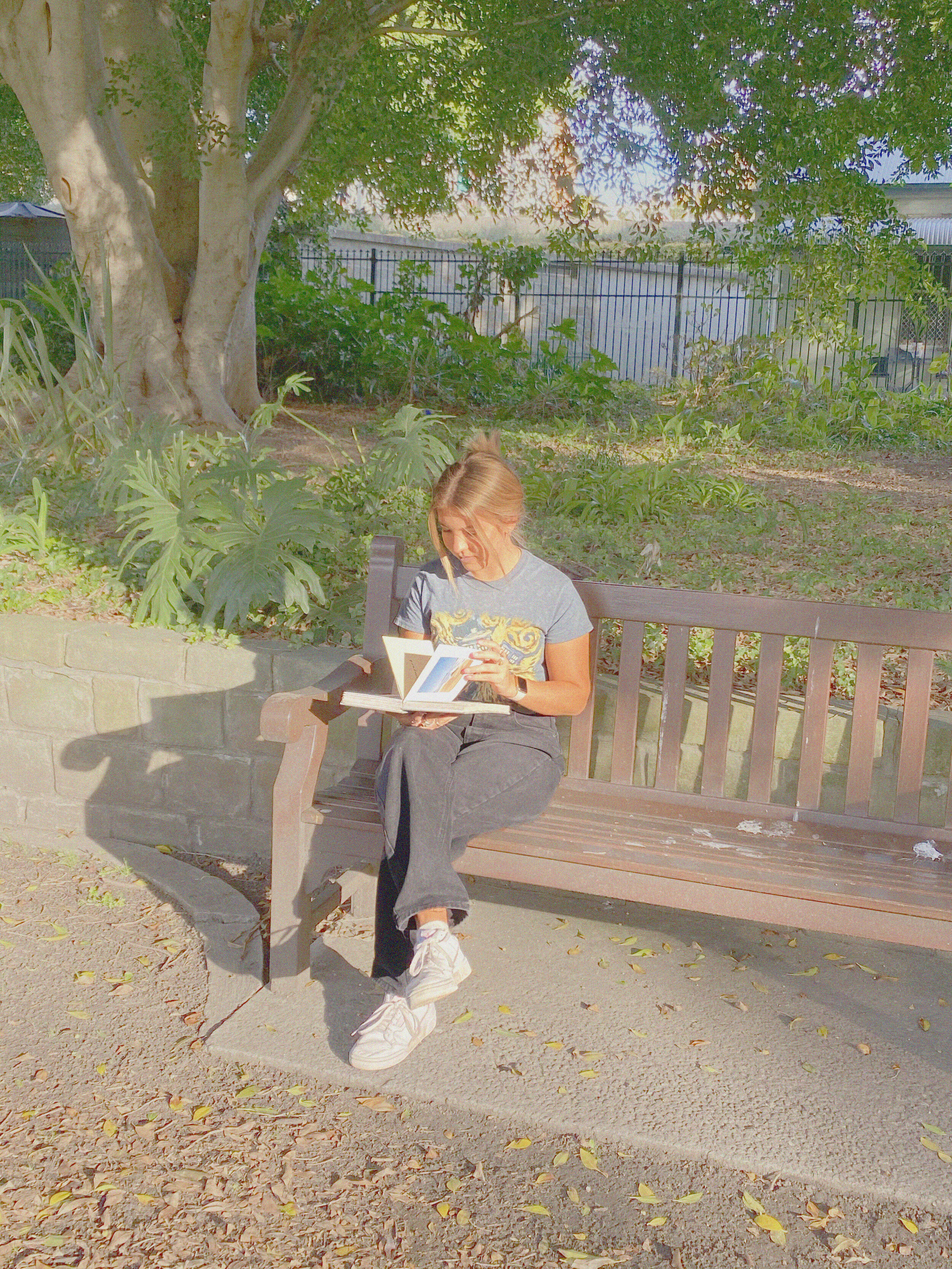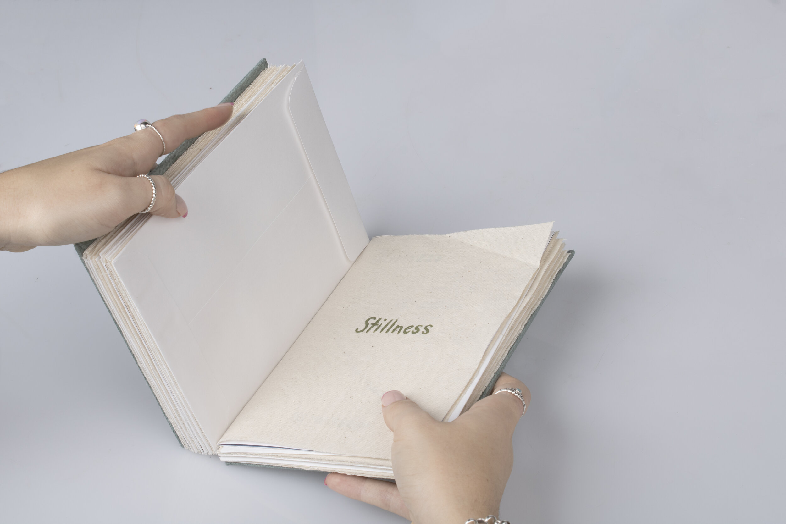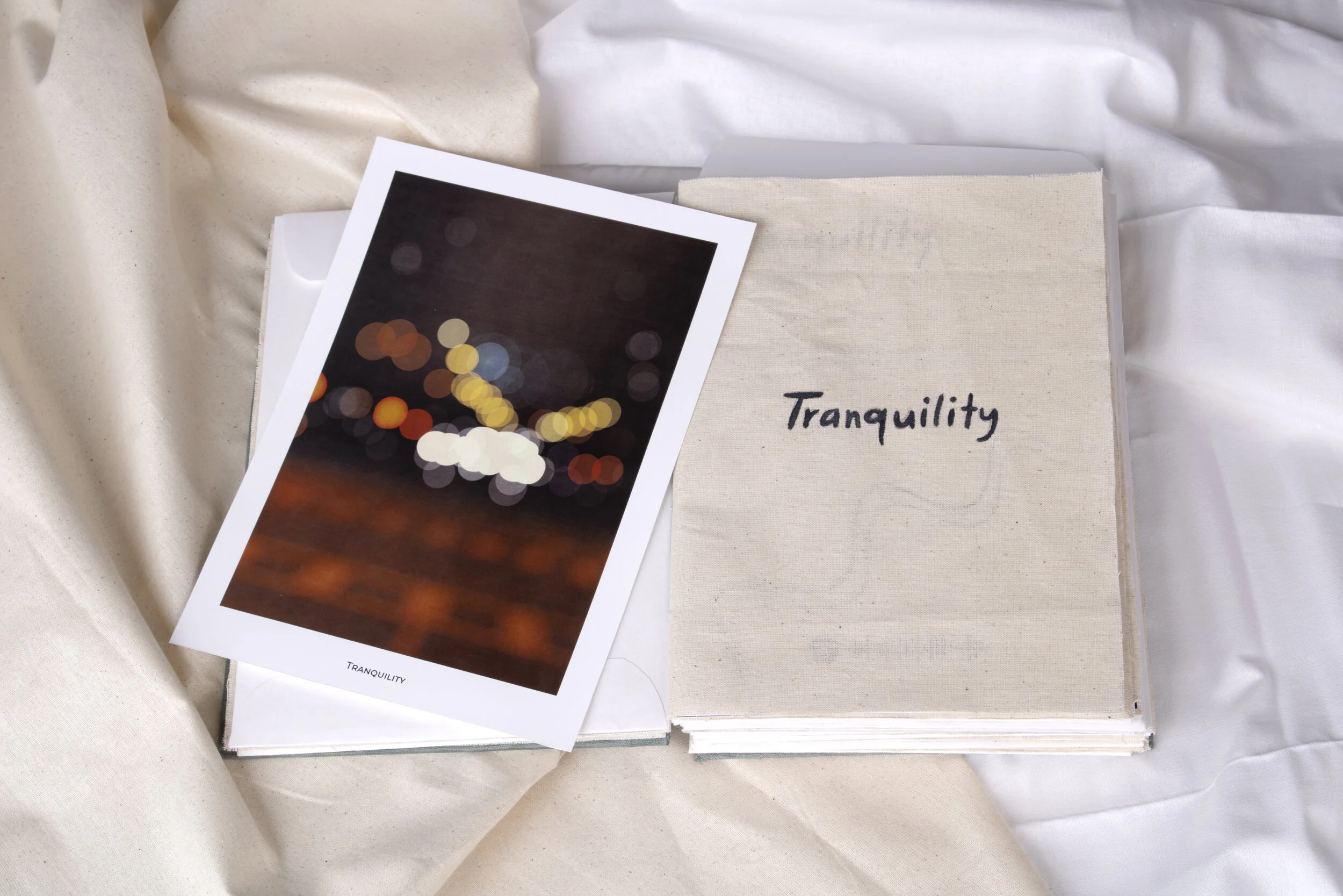
Reminisenses is a multi-sensory publication that incorporates signature scents, sounds and styles to capture some of life’s calming moments and the feelings they evoke. Through personalised typefaces, colour palettes and illustrations, the book aims to store away magic moments of the everyday to reminisce on when each tomorrow becomes a yesterday.


Designing Reminisenses
As life goes on remembering past moments becomes harder. While researching how the senses – sight, touch, taste, smell and sound – can help trigger memories and feelings, I came across a technique called reminiscence therapy. This non-invasive technique, often used to help people with dementia regain a sense of identity in the present, uses all the senses to evoke memories and feelings of the past. I became fascinated by the brain’s ability to take a multisensory snapshot of the small moments that make up our lives and store them away to reminisce on when we hear a certain song play, or look back on old photos.
I decided that I wanted to develop my own ‘moment memory book’ by combining photo-like illustrations, various typefaces, colours, scents and spotify playlists that capture calming emotions with each turn of the page. This concept combines the notion of using signature scents, sounds and styles to evoke memories and feelings, with a beautiful, handcrafted publication that could be used to help people look back on the best parts of life.
I began by brainstorming a list of 12 emotions that I related to being calm and creating 12 original, illustrative scenes, (which is no small feat when only a MacBook trackpad is used to draw). Using the layout skills and techniques picked up in my 3221 Publication design tutorials, I pieced together a document which included a title page, introductory blurb, list of 12 calming activities, the quote that inspired it all, as well as 12 double sided, double page spreads ( one for each of the emotion mini-books I planned on creating). Each mini-book included a personalised introduction page with a definition & spotify code, a double page illustration & typographic scene, and an original poem by yours truly.
This 52 page document and the 12 original posters were then printed double-sided on 210gsm, digital paper at Officeworks, and then re-printed on 180gsm matte paper after I realised that I didn’t like the glossy look and each page had to be thick enough to bind without tearing. I then trimmed each page myself, created 12 envelopes for each poster, measured and cut some thick box-board to create my book covers and glued a sage linen fabric onto them to tie in with the book. Once the hard stuff was over (Side note: it was all quite hard), I painted the emotion titles onto 12 individual pieces of calico fabric and sealed the edges with PVC glue. Once all the elements of the book were finished, I spent 3 hours binding the entire book using a tedious kettle stitch and adding scents to each of the calico mini-book covers inside the larger publication.
Despite the many paper cuts, trips to Officeworks, spills and stresses involved in the creation of this publication, I am extremely proud of the final book and all the work I put into it.


