Background
Castlereagh Regional Abattoir (CRA) was established by The Scott Family in the 1970s and, after three decades of successful operation, the plant has been mothballed since 2000.
It is now under new management and has undergone substantial refurbishment to bring the facility up to the standards essential for safe and efficient meat processing in 2020.


In with the new!
Along with their updated facilities, the new owners decided that the business needed a branding refresh. This is where I came in.
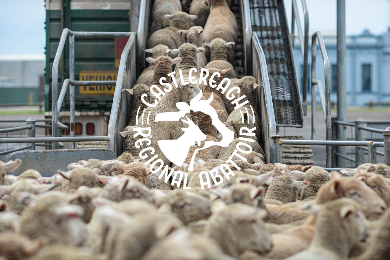
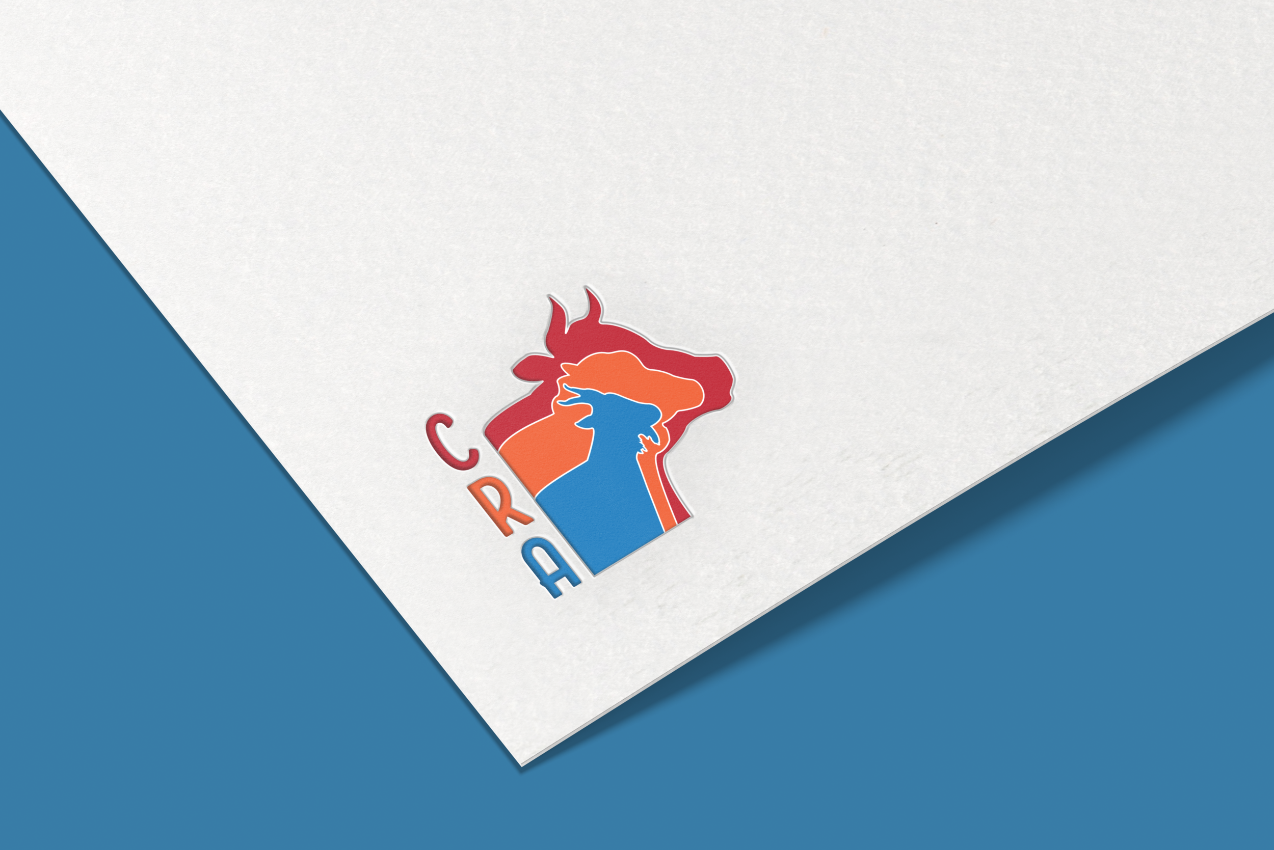
The brief for this project was to incorporate the livestock that the abattoir deals with, as well as a new colour palette, to create a logo (with variations for different media types), a business flyer to promote their re-opening and designs for other promotion e.g. billboards, hats etc.


The above design is a modern take on the traditional emblem style. By pairing 3 bold colours with striking black text, the graphic and font almost fight for attention. However, there is just enough white spacing, which is created by the circular shape, that the elements both stand out in their own right, allowing the viewers eye to easily distinguish between the two. By combining the livestock’s silhouettes, I have simplified the design, while still including context for the viewer and creating an overall modern and unique brand for the Castlereagh Regional Abattoir’s new and improved image.
