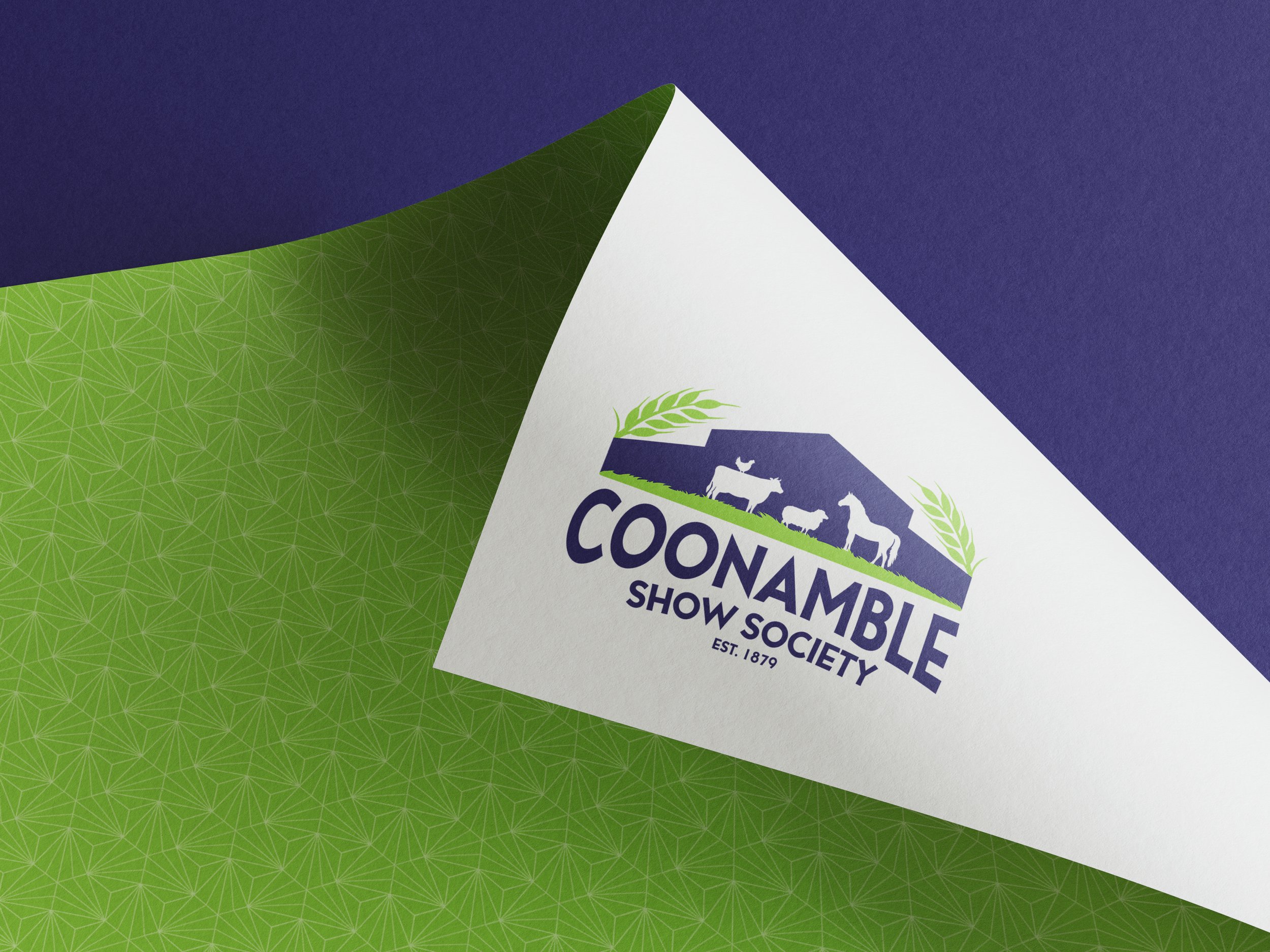
Coonamble Show Society
Established in 1879, the Coonamble Show Society has shone a spotlight on the creativity, talent and hard work of the Coonamble community, as well as brought fun and new experiences to the area two days a year, for over a century.
A committee that can create an annual, awe inspiring, event such as the ‘Coonamble Show’ deserves a logo that is going to stand the test of time with it. Which is what prompted the branding refresh I am so proud to have been a part of.
-
Having had the same clipart logo for decades, it was time for a change-up for the Coonamble Show Society. When I was given the go ahead to spice up their branding, I decided to give the committee a logo that is going to stand out. I made sure to incorporate the traditional agricultural aspects of the Coonamble Show, such as the livestock showing and equestrian events. I also included the iconic, yet recently added, big blue shed (aka the pavillion) where all the art, produce etc are displayed. It is essentially the centre of the showground and acts as a recognisable landmark for the community.
-
The lime green and navy blue was chosen mainly to match the colour of the recently erected Show Pavillion and the lush grass that surrounds it. But it also creates a bold contrast in the logo and associated branding. Essentially, it POPS!
-
After creating a couple of initial sketches, I came up with 3 design concepts for the committee to choose from (thankfully they chose my personal favourite) and then adapted the chosen sketch into a variety of vectored formats through Adobe Illustrator.
BEFORE
AFTER


